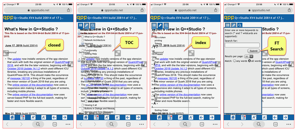
The responsive PP skin I am using is working great overall, but I just noticed a weird effect when testing it on my iPhone.
As one can see below, the TOC and Index pop-in panels are transparent (the full-text search is OK). When I test it in the chrome Console, down to very small sizes, I do not get this effect. Only on a phone. You can test it at https://www.qppstudio.net/webhelp_xv4/index.htm.
Any idea what could cause this ?
Very best regards,
Olivier
Olivier Beltrami
https://www.qppstudio.net
Worldwide Public Holidays and Calendar Data
That is most likely a cache issue from multiple tests. All current browsers are terrible at handling that, unfortunately. When you test multiple versions on the same URL in short succession they will all frequently serve up a horrible mess of old and new files that cause all kinds of weird errors.
What I am seeing on iOS is that your logo is getting clipped and the topic title is not showing up. For the logo you need to increase the value of the HEADERLOGO_PHONE_REMWIDTH variable in the Header & Footer variables group. I'm not sure what is causing the header text to be hidden, but setting the font size too large is the most likely cause. I'd need to have a look at your edited skin to be sure.
20190618_071519000_iOS.jpg
You do not have the required permissions to view the files attached to this post.
Regards,
Tim (EC Software Documentation & User Support)
Private support:
Please do not email or PM me with private support requests -- post to the forum directly.
I have removed the title from the header (set it as a single non-breaking space), as the text kept on flowing in ways I did not like, and instead included the info in the logo.
Speaking of logo, I have increased the REM width of the logo and now all is well.
BTW the PP and the Toolbox and its documentation are amazingly comprehensive. Bravo.
Very best regards,
Olivier
Olivier Beltrami
https://www.qppstudio.net
Worldwide Public Holidays and Calendar Data